Contents
Hosakahashi: Takahashi in Pure CSS
⊕ 2020-01-20
Presentation styles and tools are always a contentious discussion point when it comes to technical people, and it's always interesting to see what people think are the most important parts of a presentation. Some say that it's the images, consistency, etc. But, just like with tons of arguments about editors or libraries it often comes down to personal taste and style.
For me, I have always been extremely fond of the Takahashi and Lessig methods where there are many more slides with very little content besides what is needed to convey the discussed idea. To me presentations are fundamentally a medium to convey ideas through spoken word and I really don't think that common presentation tools do a good job at making that the focus. My tool of choice has been suckless sent for a very long time, but not without caveats. Every single time I have a conversation with someone after I presented or a corporate marketing person asks for a copy of my slide deck the inevitable conversation occurs where I have to explain that I only have a plaintext file and at most a couple of image files.
I have gone so far to actually distribute tar archives with my entire sent configuration in order to let people reproduce my presentation. Plus, running random binaries in order to view a presentation does seem to be a bit overkill.
This has been the bane of my existence for a while. So I spent a few days trying to come up with a potentially solution for this, to which I came up with a small handful of potential fixes. In the end I decided I wanted to keep it as transparent as possible by still using my .sent slides but allowing me to host them on a single web page.
the solution
I'm not a big fan of the direction a lot of the web has gone, but a simple static web application would allow me to simply link to my slide decks and let people view them. Even better, I could distribute them as a single HTML page if people wished to save them.
As a further complication I try to avoid JavaScript as much as possible and this entire site doesn't have a single line of JS. I wanted to keep it that way.
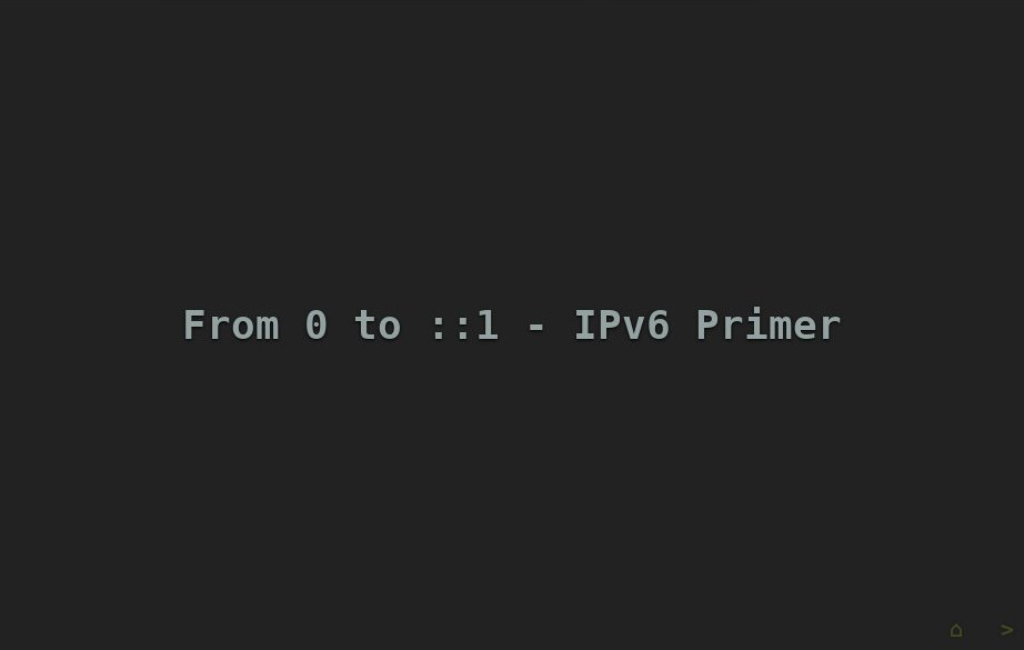
The final outcome looks like the following:

In the end I created a very very simple set of CSS rules and a set of less common CSS selectors to create the illusion of progression while only relying on simple rules.
By simply rendering a "starting" slide node that is a default id and then the :target selector you can use the URL slugs to keep track of which slide you are on (preserving the back button functionality).
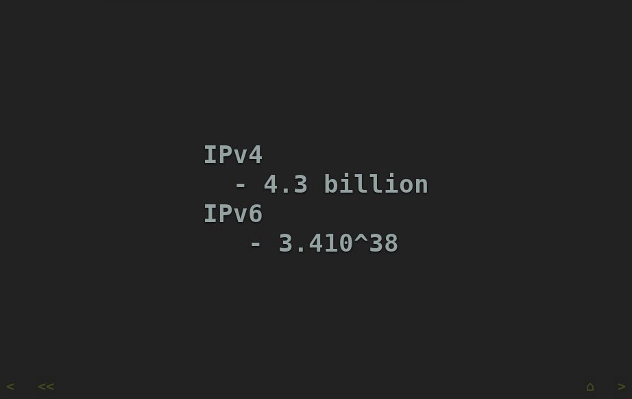
Funnily enough, this CSS selector style also allowed me to generate a navigation bar at the bottom of the screen which changes at the beginning and end of the slide deck:

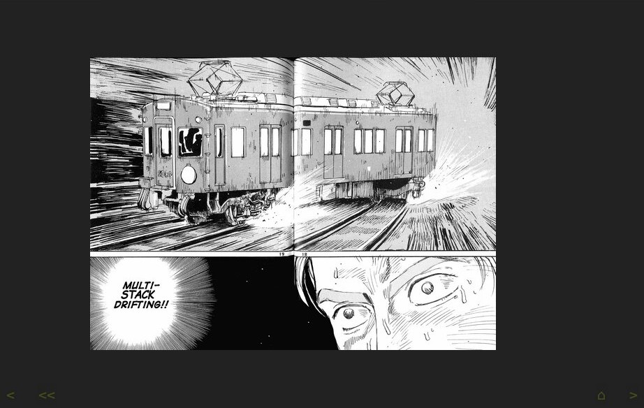
Additionally, I was able to fully emulate the sent syntax allowing for me to embed images when I actually need them:

This was generated dynamically by using a simple HTML template and staged in my website generator and the .sent extension is detected. The simple code can be found in my experimental repository here:
long term
You can see a demo at the following page:
I am no design expert and this simple example has a ton of limitations and weaknesses, for example it doesn't work very well on mobile and it doesn't print well. This is obviously very experimental and shouldn't be used by anyone who cares and it relies on some pretty crazy CSS hacks. But in the interim this is much closer to the actual style I like and will allow me to publish my talks. Stay tuned.